Trippin' Taco app - UX/UI Case study
This case study demonstrates the work of UX Design course I've been taking throughout the year 2022. I worked on designs for a menu and an ordering app for a food truck.
Trippin' Taco is a taco truck that strives to deliver fresh, tasty, and bold Mexican flavors around Norway. They offer freshly made tacos, burritos, quesadillas, and sides. Trippin' Taco targets people who like to connect food with adventure, and office people who love to go out eating during their lunch breaks.
The goal was to design an app for Trippin' Taco that allows users to locate the truck quickly and easily order and pick up fresh Mexican flavors.

User research
I conducted interviews and created empathy maps to understand the users and their needs. The primary user group that was identified through research were mainly busy creative and active adults who do not have time to cook meals and prefer eating out.
This user group confirmed initial assumptions about possible Trippin' Taco customers, but the research also showed that time was not the only factor limiting users from cooking at home. Other user problems included interests, priorities, challenges connected with grocery shopping, and more.

Time
Working adults are too busy to spend time on meal prep

Ordering
The ordering process with too many steps is difficult and frustrating to complete

Accessibility
Locating food trucks through social media is not accessible to all

Clarity of the menu
Inconsistent menus without pictures and text-heavy menus are often difficult to read and order from

Goals:
- to be able to plan meals in advance
- to go on bicycle rides with access to good food and drink on his way home
- to track calorie intake
- to have a more structured work life
Frustrations:
- “I'm annoyed when there are hidden fees; sometimes, it is enough for me to cancel the whole order.”
- “I am frustrated when my order is incomplete or incorrect.”
- “I am frustrated when the menu is not clear and I don't know what I am ordering.”
Problem statement:
Dustin is a freelancer and cycling coach who needs a food ordering app with a clear menu and no hidden fees, to order food in advance, and to find the location of a food truck, as he plans his meals and includes eating at his favorite food truck in his long bike rides.
“Everything tastes better when it is made fresh and eaten outside.”

Goals:
- to eat outside near her office
- to have a better work/life balance
- to spend more time socializing and use that opportunity to explore new places and try new food
Frustrations:
- “I'm annoyed when my order takes too long and the delivery time isn't communicated clearly.”
- “I am frustrated when I have to create an account just to see the menu in ordering maps.”
- “I am frustrated when food is not fresh and is too cold.”
Problem statement:
Gina is a busy project manager who needs easy access to a food ordering app with as little hassle as possible and to know the location of the food truck, because she doesn't have time to cook herself and prefers to eat out with friends.
“I love the outdoor element of food trucks and sharing the atmosphere with my friends.”
User Journeys

Information Architecture

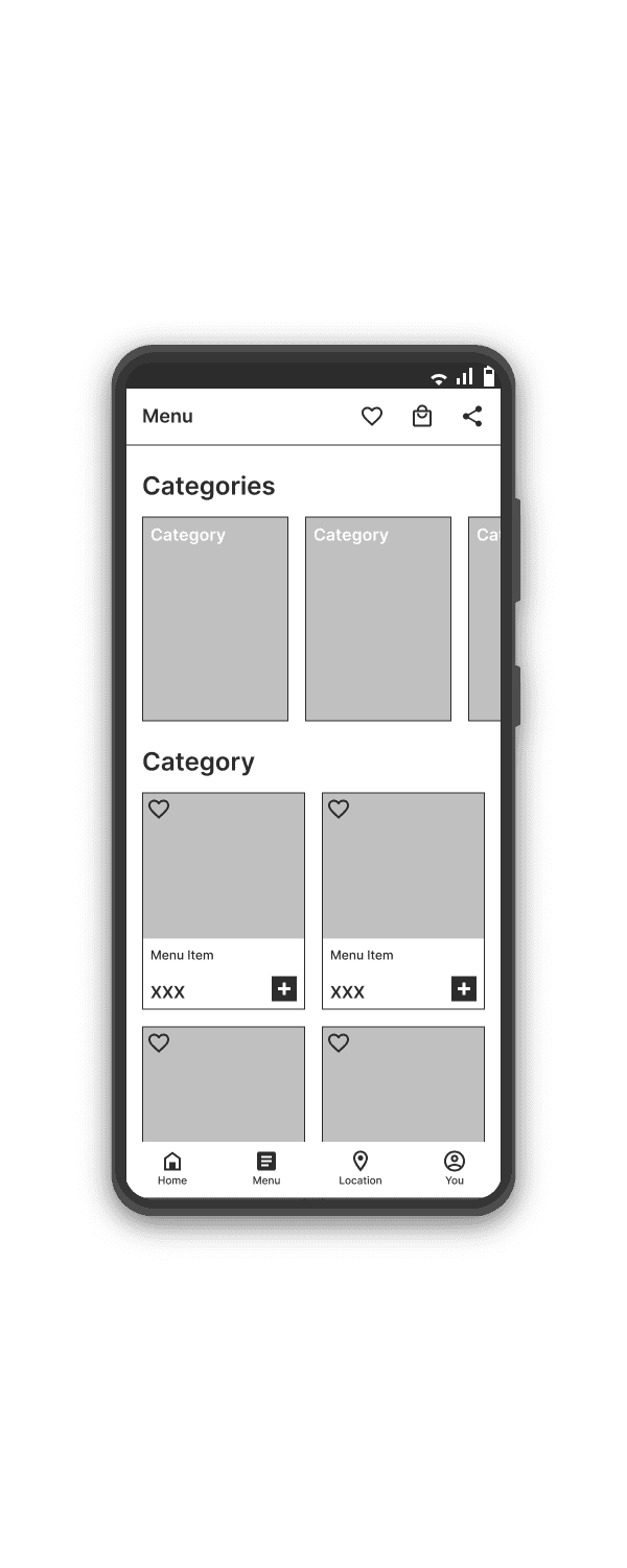
Wireframes
Taking the time to draft iterations of each screen of the app on paper ensured that the elements that made it to digital wireframes would be well-suited to address user pain points. On the home screen, I prioritized a quick process of locating the food truck and easy access to favorite orders, and in the app, I focused on an easy and clear ordering process to help users save time.


As the initial design phase continued, I made sure to incorporate feedback and findings from the user research in screen designs.
Using the completed set of digital wireframes, I created a low-fidelity prototype. The primary flow I connected was adding a taco to the shopping bag and completing the order. The secondary flow was locating the food truck, so the prototype could be used in the following usability study.

I conducted two rounds of usability studies. Findings from the first study helped guide the design from wireframes to mockups. The second study used a high-fidelity prototype and revealed what aspects of the mockups needed refining.

Round 1 Findings
1. Users need more information about the food truck's location
2. Users need clear navigation in the app, particularly easy access to the shopping bag from all screens

Round 2 Findings
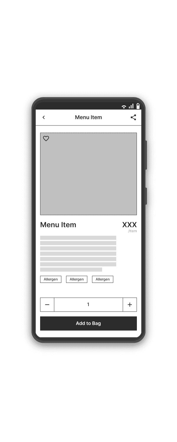
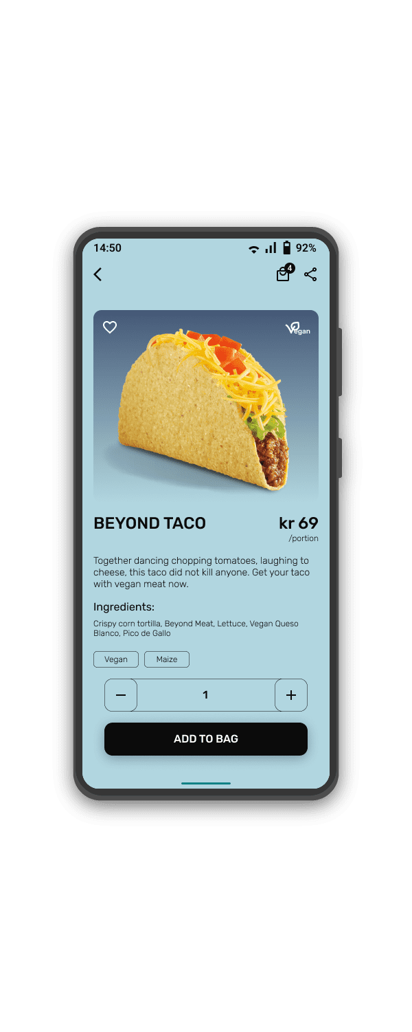
1. Users need attractive descriptions in the menu item's detail in addition to the list of ingredients and allergens
2. Users need a filter function in the menu section
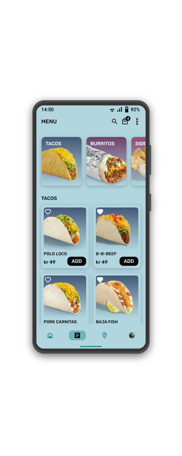
Early designs give users fast access to a menu based on categories, but after the usability studies, I also added a search icon to give users quick and easy access to the filter function to further specify their preferences.
The second usability study revealed that some users needed a filter, additional visual cues for vegetarian or vegan options, and a more poetic description to add personality to the tacos.

The final high-fidelity prototype presented cleaner user flows for ordering tacos and locating the food truck. It also met user needs for accessibility through a filter function and visual design principles.

Accessibility Considerations
Provided access to users who have food allergies or specific dietary preferences through a filter function, tags, and visual cues.
Used detailed imagery with alternative text for tacos, burritos, sides, and drinks to help all users better understand the designs.
Used WCAG Standards and similar to help content easier to read and navigate in.
Next Steps
Conduct another round of usability studies to validate whether the pain points users experienced have been effectively addressed.
Create onboarding screens to help users see how to navigate the app and where to find important sections of the app.
© 2026 Omar Salem. All Rights Reserved.